Checking dollar spot with model probability
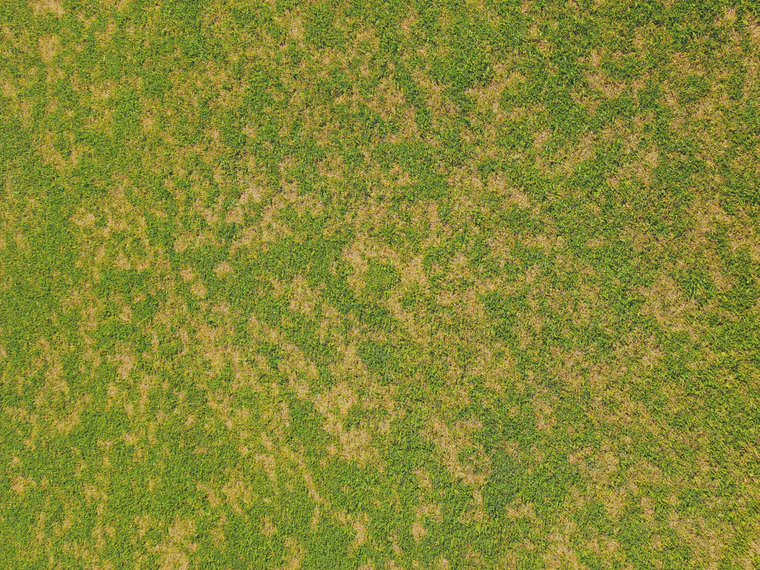
On a recent trip to southern Europe, I was walking on a fairway and looking down at the grass. I’d seen some bermudagrass (Cynodon) fairways and did not notice any dollar spot. Then on this course with bentgrass, Poa annua, and kikuyugrass in the fairways, I saw a lot of dollar spot.
When I see an outbreak of dollar spot like this, I make a note to check the Smith-Kerns probability model to see what the numbers are. I’m just checking this out of curiosity, but if I were a turfgrass manager, I’d be checking forecasts and historical data with an eye to minimizing the intensity of any disease outbreaks.
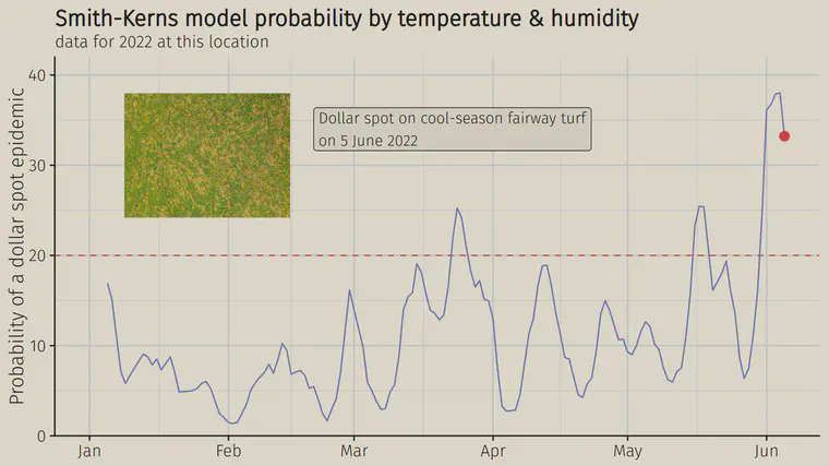
When I looked up the data for this location, it matches what I’d expect. I took that photo on June 5. And on the chart, this location had been above a 20% epidemic probability for about a week, and was just past the peak probability reached so far in the year.
One of the many charts in the PACE Turf weather and climate appraisal section (available to PACE Turf information service subscribers) is the past five years of Smith-Kerns probability for one’s location.
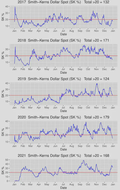
In the past five years, The number of days above 20% probability of an epidemic, which is a general level of expected higher risk for dollar spot, ranged from 124 days in 2019 to 179 days in 2020. I think it’s especially interesting to see how the probability never got consistently above 20% in 2019 until the end of June, while in 2020 and 2021 there were weeks—months even—with probability above 20% prior to the start of June.
Knowing what’s happening, what’s forecasted, and what’s normal for a location can be a powerful tool for disease management decision-making, and I really like how the PACE Turf charts provide the information in this format.