Putting green data from measurement to summary
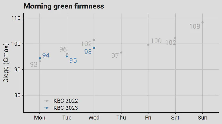
One of the measurements I routinely make on putting greens is the surface hardness—or firmness—as measured by the sdi golf course firmness tester. What I provide to the golf course superintendent, at least during tournaments, is a summary chart like this one. I provide this chart after making the morning measurements.
Those values that have been condensed down to a single number start with multiple measurements per green. This video shows how I make the measurements.
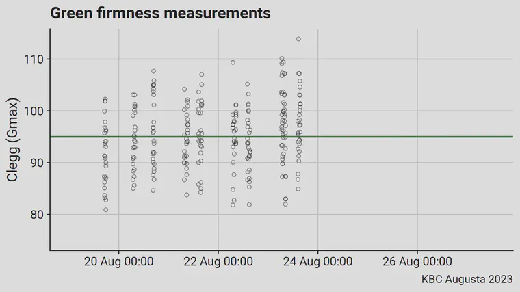
If I would plot all those measurements, by time, it would look like this next chart. This shows every single drop I make, across all the greens that get measured.
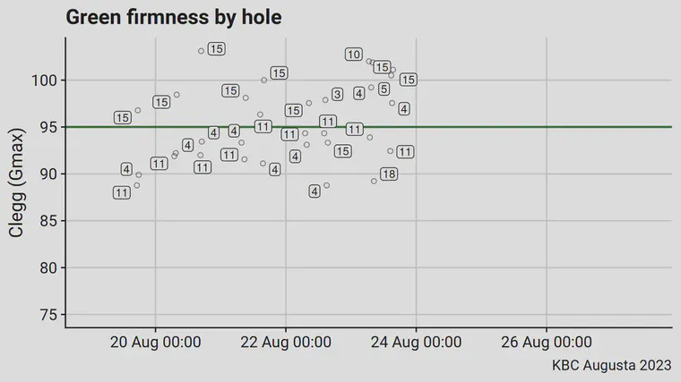
From those drops, I calculate the average on a green by green basis. Even this eventually gets too much to look at for the superintendent, so I rarely share this next chart, and I never share the previous one.
From the data of every drop, and from the data from the green by green averages, I can calculate the standard deviation of the measurements and other statistics that describe the variation in the measurements. It’s at this stage that I would consider whether a particular green is an outlier, in that it has measured values that are so different from others on the property at the same time that it might play noticeably different.
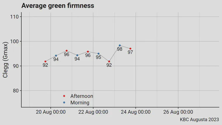
In the mornings, I’ve provided the course superintendent the chart that shows the daily morning average with the comparison to the previous year’s data. In the afternoons, I provide the chart below. This one shows the morning (after morning work is complete and before play begins) and the afternoon (immediately after play has ended, and prior to any afternoon work) averages, and can be used for planning the overnight irrigation, if any, and for any adjustments to the next morning’s work.
That’s how I’ve been doing it. I used the surface hardness data as an example here. I make the same charts for stimpmeter measurements, bobble test, and soil water content, and present them in the same way for consistency.
Much of the work that is done to produce these conditions happens the other 51 weeks of the year. There’s not much that can be done to adjust the playing conditions during tournament week itself. By presenting the data as clearly as possible, it’s possible to make any necessary adjustments during tournament week. By having a lot of raw data in the background that can be used to check variability both within greens and between greens, it’s then possible to sit down after the tournament and make plans for any work adjustments through the upcoming year to plan for the next tournament.