Low light locations for warm-season grasses
I’ll start with a tautology. Warm-season grass species grow, and are used as turfgrasses, in locations with warm temperatures. Where it gets interesting is the interaction of light—specifically the photosynthetically active radiation (PAR)—with temperature, and with water supply or drought stress.
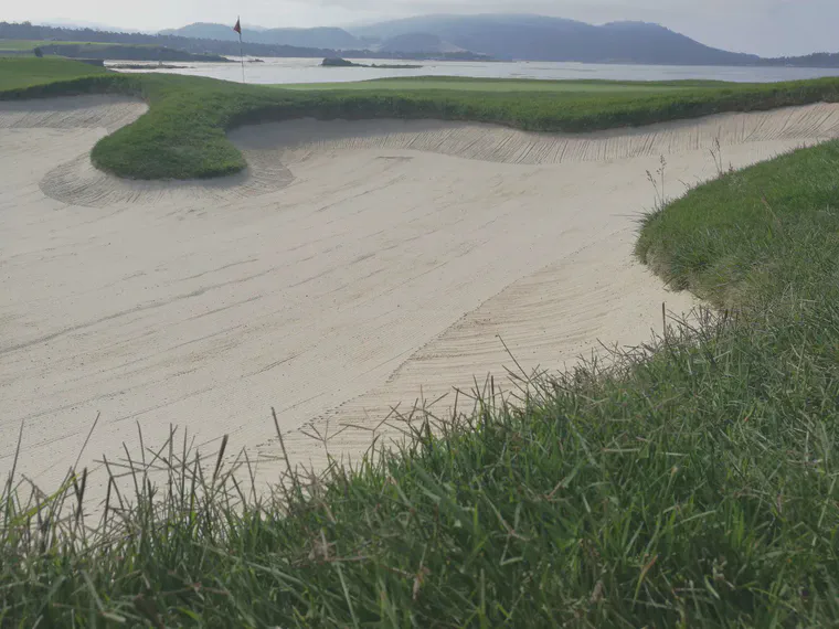
For example, bermudagrass (Cynodon dactylon) and manilagrass (Zoysia matrella) are both warm-season grasses, but in a place like Pebble Beach, one can find plenty of wild bermudagrass, but no manilagrass.
At a park in southern Thailand, there’s plenty of manilagrass and very little bermudagrass.
Why are the different species growing in these locations? It’s because there is more to which grasses can grow than just temperature. There is also the amount of plant available water (or conversely, the level of drought stress), and there is the PAR.
There are a lot of ways to look at the climate-induced shade stress for warm-season (C4) grass. In this chart, I plotted some locations from around the world as a scatterplot based on two calculations.1 One is the average daily light integral (DLI) on days with an average air temperature above 24 °C (75 °F), and the other is the fraction of days above that temperature threshold with a DLI less than 30.
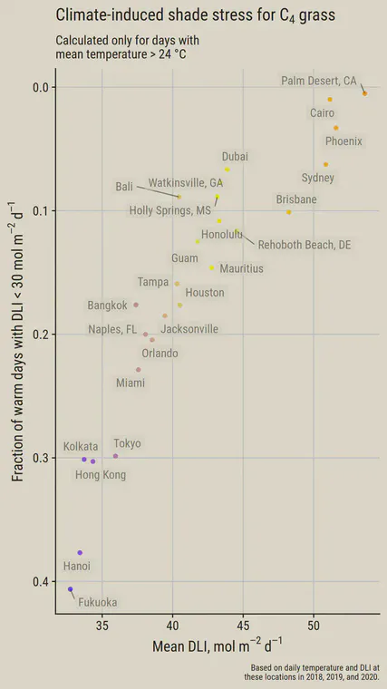
Of the cities selected, there are Palm Desert, Cairo, and Phoenix at one extreme—all locations with a high DLI during times of warm temperatures. At the other extreme, where the DLI is relatively low on days with warm-temperatures, we find locations such as Fukuoka, Hanoi, Hong Kong, and Kolkata.
I think the cumulative effect of climate-induced shade stress will show based on what happens when the temperatures are at an optimum level for growth. When it is cold and warm-season grasses are dormant, for example, I don’t think the DLI matters much. The data in the chart above are one way out of many to visualize this effect.
The chart below shows missing DLI. Clear day DLI can be calculated for any location based on day of year and latitude. I made that calculation for these locations, then looked at the average DLI for the entire year, and at the average difference between each day’s potential DLI (if it were a clear day) and the actual DLI.
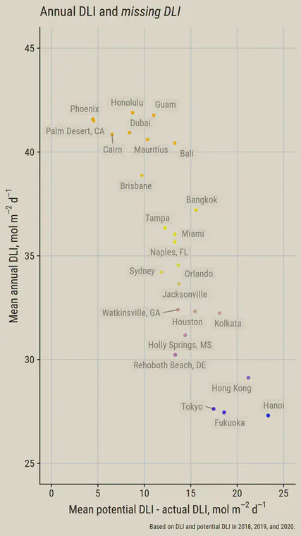
In this chart, I look at the entire year. There’s no separating out the warm days. I haven’t figured out a favorite way to show this yet. I’m thinking that cumulative days with a temperature above a threshold and with DLI below a threshold may be an interesting way to look at this too.